Rotten Tomatoes Redesign
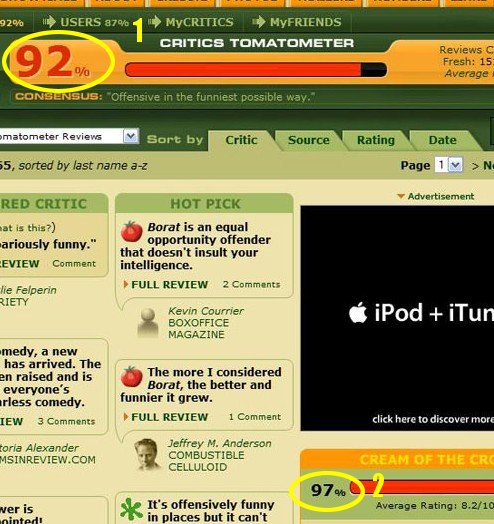
Rotten Tomatoes recently did a site redesign. It looks a lot shinier, but it broke my primary use case. Here’s what I used to do when I went to the page for a particular movie:
- Read the fresh percentage for All Critics.
- Read the fresh percentage for the Top Critics.
- Compare the two percentages.

Why do I use RT in this way? Because I have found that if the All Critics percentage is fairly high (over 75%) and the Top Critics percentage is significantly higher (at least 7 or 8%), then I will very likely enjoy the movie. However, even if the All Critics percentage is fairly high, but the Top Critics is significantly lower, I probably won’t like the movie. The key here is that I find the delta of the two percentages to be a better indicator than either of them individually.
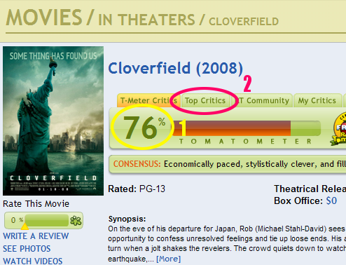
Now, with the new Rotten Tomatoes site, my workflow has changed to this:
- Read the fresh percentage for All Critics.
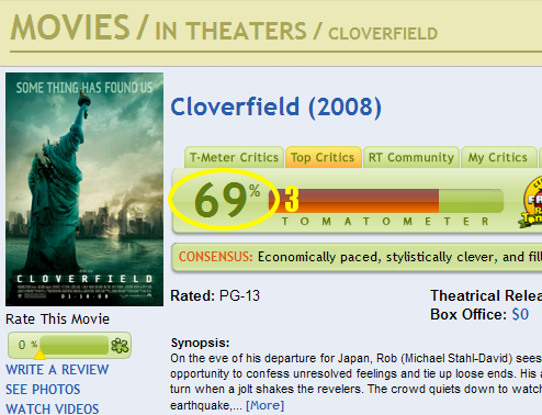
- Click on Top Critics.
- Read the fresh percentage for the Top Critics.
- Recall the All Critics percentage from memory (where difficulty increases based on page load time and how many movies I’ve already looked at in this browsing session).
- Compare the two percentages.


I like this workflow a lot less because it creates three negative effects for me:
- It takes more work to do what I want to do. I have to click on the “Top Critics” tab, whereas before I didn’t have to click on anything.
- It takes longer to do what I want to do, since I have to click on the Top Critics tab and wait for the second page to load. On a fast connection, and when RT is running quickly, this isn’t that big of a deal since the time is very short. However, on a slow connection or if the RT servers are having problems, I have to wait a long time.
- I have to remember something. To put it in the terms that Don Norman uses in his book The Design of Everyday Things, knowledge that was previously in the world must now be kept in the head. Norman identifies this as a design flaw (at least for this use case), because it is a lot harder to remember the number than to read it. This is especially true if it takes a long time to load the Top Critics page or if I decide to read other things (like the review of a particular critic) between when I read the first number and when I read the second.
I can think of three reasons why the new layout was done the way it was:
- Usability: Almost no one compares the two percentages. If there are only three people in the world that compare the two percentages, but lots of people like to read the film news and look at photos, then the change makes sense. Removing the Top Critics sidebar from the main page freed up space for more frequently used things.
- Greed: Because lots of people want to compare the two percentages, RT can get twice as many page views (and therefore more ad impressions and clicks) by putting the two percentages on different pages.
- Ignorance: They either don’t know how many people are comparing the two percentages, or they don’t know that splitting them up into two pages decreases usability.
If I had to guess, I would give RT the benefit of the doubt and say that they made the change for increased usability. The site does a lot of things right when it comes to usability, so they probably got this right, as well. It still annoys me when I have to use it, though.