RT Update

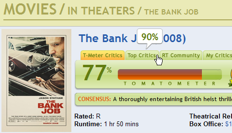
I wrote a few weeks ago about how Rotten Tomatoes did a redesign of their site that broke my primary use case. Since then, they have done an update that makes things a lot better for me, though it’s still not as convenient as the original design. Right now, if you hover over any of the tabs for different groups of ratings, you get a popup that tells you that group’s percentage of positive reviews. In my case, I’m interested in the Top Critics group:

Hovering over the Top Critics tab on RT

While this does allow you to compare the percentages much more easily, it’s not quite perfect. On the plus side, it displays both percentages at the same time and it’s quite easy to discover. Anyone who is interested in the Top Critics information will move to click on the tab header, and when they move the pointer over it, they’ll see the popup.

On the downside, it does require fairly precise mousing (and holding the mouse still) for the whole time you want to read the number. This makes it much less accessible to those who have trouble acquiring small targets and keeping the pointer still, such as the elderly or disabled using a mouse. Additionally, you have to use the pointer to see it, which makes it inaccessible to those navigating with just the keyboard.

Windows Live SkyDrive

I haven’t really gotten into the whole online backup thing. I’m not sure I want to spend a week uploading my files on my cable Internet connection, only to depend on some company keeping my files safe and private.

But, yesterday it was announced that Microsoft’s new online backup/file sharing service has come out of beta. It’s free and all you need is a Windows LiveID. I have one of those, so I thought I’d take a minute to try it out.

I was tweaking my .bashrc a couple of days ago, so I thought I’d upload that. It’s a nice small file, so it shouldn’t take long to upload, and it might be useful to have it accessible from a web browser.

So, I downloaded it to my local machine. It was pretty easy to figure out how to upload it to a folder on my SkyDrive, and I just had to pick it from the hard drive using a file browser.

Upload Form

Just click upload and we’re all set!

None of your files were uploaded?

Clicking on the “Learn why uploading may fail” link was not helpful. My file doesn’t violate any of the rules on the page.

But then I remembered, Windows doesn’t like it if you start a filename with a dot. You can copy a file around that starts with a dot, but you can’t rename files in Windows Explorer to start with dots. Of course, the service surely uses Windows servers, so I bet it has something to do with that. How could I find out if that was the real problem? How about renaming the file to not have the dot and retry?

No dot filename has been uploaded

Wonderful. But now I want to be able to download it with the real filename, so I can just drop it on a Linux machine and go. So I tried to rename it.

Rename message

Oh, now I get a real error message. At least I know what the problem is.

But that’s a pretty silly restriction to not allow filenames that start or end with dots. I understand that there’s an arbitrary restriction on those files from Windows Explorer, but you can store dotfiles on NTFS partitions without a problem. So the programmers had to add extra code to explicitly disallow these files for no good reason. Why?

Night Watch

I saw Night Watch a few days ago. The film wasn’t bad; it had great cinematography and decent effects. Sadly, the story was a dim shadow of the one in the book, but I suppose that’s to be expected.

The most interesting part of the movie, for me, was the subtitling. I watched the DVD with the Russian audio and English subtitles. The subtitles were beautiful, dynamic, and surprising. The font was nice to look at and easy to read, even on my 27” SDTV. The words appeared and disappeared in unexpected ways on the screen. For example, sometimes they would be revealed from behind a character as he moved across the screen. Other times, multiple phrases would fade in and out at different times at different places on the screen. They were not constrained to the bottom of the screen: they would appear at any place on the screen. During conversations, the lines of each character would appear near the person on the screen, so it was easy to tell who said what. One of the most interesting presentations was of “The Call”, the siren song of the vampire to her victim. The words (e.g. “Come to me”) would appear on the screen blood-red, then swirl away like drops in a stream.

Time magazine has an interesting writeup about subtitles that mentions Night Watch, and has a poor quality screenshot of the subtitling of The Call. A DVD Times post has a number of other screenshots that show the subtitles.

Rotten Tomatoes Redesign

Rotten Tomatoes recently did a site redesign. It looks a lot shinier, but it broke my primary use case. Here’s what I used to do when I went to the page for a particular movie:

  1. Read the fresh percentage for All Critics.
  2. Read the fresh percentage for the Top Critics.
  3. Compare the two percentages.

Old Rotten Tomatoes Layout

Why do I use RT in this way? Because I have found that if the All Critics percentage is fairly high (over 75%) and the Top Critics percentage is significantly higher (at least 7 or 8%), then I will very likely enjoy the movie. However, even if the All Critics percentage is fairly high, but the Top Critics is significantly lower, I probably won’t like the movie. The key here is that I find the delta of the two percentages to be a better indicator than either of them individually.

Now, with the new Rotten Tomatoes site, my workflow has changed to this:

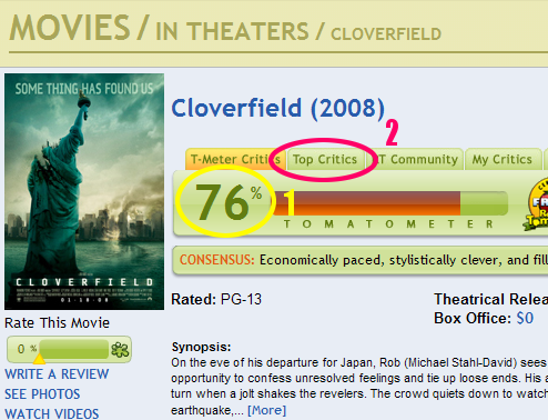
  1. Read the fresh percentage for All Critics.
  2. Click on Top Critics.
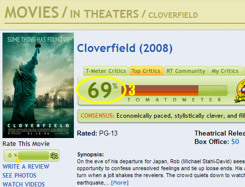
  3. Read the fresh percentage for the Top Critics.
  4. Recall the All Critics percentage from memory (where difficulty increases based on page load time and how many movies I’ve already looked at in this browsing session).
  5. Compare the two percentages.

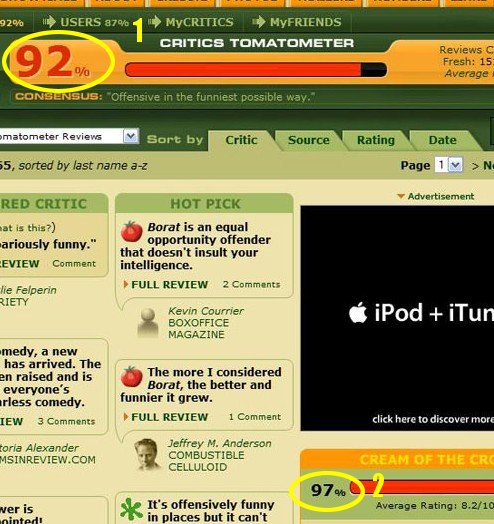
New Rotten Tomatoes Layout - All Reviewers

New Rotten Tomatoes Layout - Cream

I like this workflow a lot less because it creates three negative effects for me:

  • It takes more work to do what I want to do. I have to click on the “Top Critics” tab, whereas before I didn’t have to click on anything.
  • It takes longer to do what I want to do, since I have to click on the Top Critics tab and wait for the second page to load. On a fast connection, and when RT is running quickly, this isn’t that big of a deal since the time is very short. However, on a slow connection or if the RT servers are having problems, I have to wait a long time.
  • I have to remember something. To put it in the terms that Don Norman uses in his book The Design of Everyday Things, knowledge that was previously in the world must now be kept in the head. Norman identifies this as a design flaw (at least for this use case), because it is a lot harder to remember the number than to read it. This is especially true if it takes a long time to load the Top Critics page or if I decide to read other things (like the review of a particular critic) between when I read the first number and when I read the second.

I can think of three reasons why the new layout was done the way it was:

  • Usability: Almost no one compares the two percentages. If there are only three people in the world that compare the two percentages, but lots of people like to read the film news and look at photos, then the change makes sense. Removing the Top Critics sidebar from the main page freed up space for more frequently used things.
  • Greed: Because lots of people want to compare the two percentages, RT can get twice as many page views (and therefore more ad impressions and clicks) by putting the two percentages on different pages.
  • Ignorance: They either don’t know how many people are comparing the two percentages, or they don’t know that splitting them up into two pages decreases usability.

If I had to guess, I would give RT the benefit of the doubt and say that they made the change for increased usability. The site does a lot of things right when it comes to usability, so they probably got this right, as well. It still annoys me when I have to use it, though.

Maximize, Zoom, and the Art of Window Management

A while back, Jeff Atwood wrote about the “maximize” behavior in Windows and Mac OS. The subject: There’s a button on the top-right of each window in Microsoft Windows that resizes the window to fill the screen. There’s a green button on the top-left of each window in Mac OS with a + on it, that Windows users often think will cause the window to fill the screen, but it actually resizes the window to its “best size”. Apple calls this Zoom.
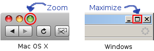
In my experience, MS Windows users hate the Mac way of doing things, and Mac users hate the Windows way of doing things. The comments on Jeff’s post reinforce this impression. I have often wondered why this little difference causes such strong reactions. I’m pretty sure it has to do with the taskbar/dock.

In MS Windows, each window has an associated button on the taskbar1. These buttons stay in the same order2 and in the same place3. This means that no matter what you do to a window, whether you maximize, minimize, resize, or move it, there is always a part of the window showing: the taskbar button. No window can ever be completely hidden. You can get to every open window with a single click. And since the buttons are always in the same place, you can use spatial relationships to remember which window is which, in addition to the icon and text label on each button. So, Windows users like to maximize windows, because you get the maximum amount of screen space for the program you’re using, but navigating between windows is still fast and easy.

In Mac OS X, that isn’t the case. There is no button on the toolbar for a window (only entire programs, which often have multiple windows). Windows can be completely hidden behind each other. Then, if you want to see one of the windows that isn’t on top, you have to move all of the windows above it. Since this is the case, users have to take it upon themselves to ensure that they can always see a piece of each window. This results in not wanting to maximize any windows. If they do that, all of the other windows will be completely hidden and it will be a lot of work to navigate between them.

Recent versions of Mac OS X have a feature that is an attempt to work around this limitation: Exposé. Press a function key (or move your mouse pointer to a specific corner of the screen) and all of your windows shrink down to thumbnail views so you can click on the one you want. This works fairly well if you a) don’t have many windows open, and b) are using windows that look distinctive from one another. But, if you have so many windows open that each one is tiny, it doesn’t help you much. Similarly, if you have 10 windows open from each application, you can’t tell which one you want by looking at thumbnails of them. Here’s what a Windows Exposé clone might look like on my desktop if I’m working on a programming project:
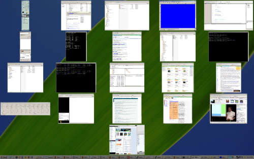
As you can see, the windows are so small that it’s hard to make out what is on each one, unless it is something distinctive like the video in the bottom right corner. Also, a number of windows look the same, so if I want to find that one command prompt window, which of the black squares do I click on?

But even if these problems didn’t exist, Exposé would still be more work to use than clicking on windows in the taskbar. The taskbar requires only one click, Exposé requires either a mouse move to a corner or a keyboard button press, plus a mouse click.

Of course, the Windows taskbar isn’t perfect either. Once there are enough windows open, there is almost no text on each taskbar button, so you can’t tell different windows from the same application apart.

Even so, I still think the Windows maximize button is way better than that stupid zoom.

Footnotes

  1. Unless you use the default “Group similar taskbar buttons” setting in Windows XP and later. back
  2. Except in Windows Vista where the buttons rearrange themselves to group windows from the same program together. back
  3. They shrink and grow to accommodate more and less buttons, changing their size and absolute position somewhat, but the relative positions of the buttons to each other are maintained. back